
Podcast: Play in new window | Download

Transcription:
(This is a direct transcription please excuse any typing mistakes.)
One of the latest articles on Google’s Webmaster Blog is about search and how this is going to change drastically in April 2015. It is all around mobile and if you don’t have a mobile friendly website, or a website that can be accessed from different devices, watch out because you could drop off the face of Google.
Today’s topic is about search marketing and mobile friendly websites and how Google is finally going to do something about it when it comes to search engine rankings.
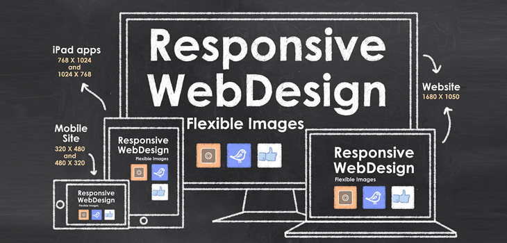
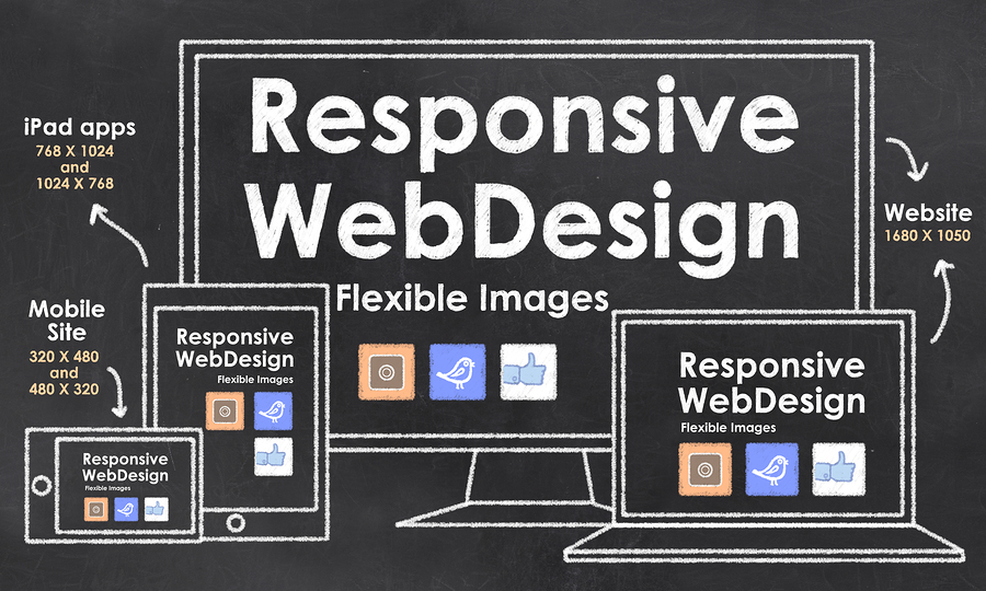
Is your website responsive In other words, can people view the content of your website whether they are on a mobile device, a tablet or a PC?
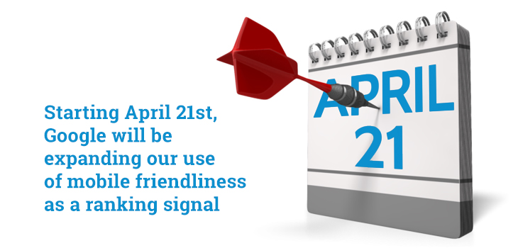
Why? Because on April 21st, 2015 there will be changes.
If you have a look on the Google Webmaster’s Central Blog you’ll see that starting April 21st and I quote verbatim:
“Starting April 21st, we will be expanding our use of mobile friendliness as a ranking signal. This change will affect mobile searches in all languages worldwide and will have a significant, (when Google uses that word it usually is) significant impact in our search results. Consequently, users will find it easy to get relevant high quality search results that are optimized for their devices.”
Basically that means that if you have a website that people can’t see very well then you may struggle with your search engine rankings. That is particularly important for websites that have been around a long time, that have got good rankings then that could be a major thing for you.
There is worldwide population of 6.8 Billion, 4 Billion of them have a mobile phone and they use it consistently. A fascinating piece of information for you – 50% of people go on multiple devices at the same time at least 2 or 3 times a week.
We’ve all done this haven’t we? We sit and watch TV and something comes on – I remember a while ago I was watching Queen and they have new guy called Adam Lambert and he’s all the rage and I really like Queen and I thought ‘Where are they on?’ So I was watching the program I think it was New Year’s Eve or something like that. So then I took the tablet out and started looking how I can get a ticket to see them.
If you think of your own behavior, it is something that you do a lot. Now imagine that your candidates and your clients are doing that as well. I think depending on the age group that you serve, then we are all on mobile devices and we access information and we search.
So Google wants to give the user the best possible experience that it can. So what it’s now going to start doing is to penalise you in your search engine rankings. It doesn’t say that but what it’s going to do is it is going to pre-select for its users and people that have a mobile friendly and responsive websites.
What’s going to make a good mobile responsive website? Well, Google will tell you what makes a responsive website – obviously one that downsizes depending on the device that you are looking at.
There’s about 4 or 5 different things you want to think about. Let’s just go through them in order.
- It needs to fit the small screen, downsized and looks logical. That seems really sensible but your web developers will understand how to do that. There are different frameworks and wireframes (nice technical geeky jargon for you that you can use) so it fits to a screen and still looks good.
- Don’t make people do too many clicks. There used to be a saying “No more than 3 clicks.” It’s now actually changed. People say “No more than 2 clicks” to get the information that you want. Let’s just imagine that your job board – a lot of candidates are going to be looking at your job board. You need to have that somewhere on the home page so it’s just one click away so people can go and have a look at it.
- If you have an option to go to the full non-mobile site. That could be something you could consider.
- Have a search bar. People are now used to having a search bar that they can use to go around your site and see what is there.

- Obviously you ideally want it to look clean and efficient but remember you are downsizing things to a smaller size. What I would say is don’t make it cluttered. That is the main thing. Don’t make your home page cluttered.
Make it nice and seamless so people know what they are doing. Make it logical where they are going. So if you’ve got your candidates section or your clients section, you’ve got your job board and your vacancies and your blog so people can go there and find out what they are looking for.
Another thing is around buttons. Make the buttons friendly, bigger so guys with bigger hands can click through. Make sure the buttons are friendly for people to use.
Something else I always suggest when coaching people around blog posts is to make sure that you space out content– so you notice all our blog posts are spaced out quite well because the last thing you want is this thing bunching up on the website and people can’t read them. And the other thing you can look at and your web developers would be able to give some advice on this, is maybe a click to call. So there’s an ability to do that as well from your web developer.
So April 2015 will be a landmark month and it would be very interesting to see how that affects people because many people have switched over.
We’ve been suggesting our viewers and listeners get a mobile friendly website. I think we’ve been talking about this to our clients for 3 years and people are now starting to realize that this is going to be so important particularly if people are searching for you online which of course they will be. People are looking for recruitment companies as the market is getting more buoyant. You need to stand a sporting chance of getting found. One of the great ways of doing this from a search engine perspective nowadays is get yourself a responsive website.
So this is Denise, in summary – April, big month for search and make sure you that rise to the top rather than sink to the bottom. Speak soon!
Click here to view the Google Wemaster’s Central Blog.
P.S. Do you need help with creating content for your responsive websites? To find out how we can help, fill out the contact form here and add the word content in the title and we will get in touch.
This podcast was hosted by Denise Oyston. Follow us on Google+
Important
To accelerate your marketing at speed, you need to know your starting point and be clear on what good marketing looks like.
That is why we have designed a complimentary Marketing Audit Checklist that you can download here.
As an ambitious recruitment organisation, THE marketing strategy to master is email marketing. It will consistently deliver both candidates and clients.
In a special complimentary training Webinar, we give you the template for writing emails we use for our clients and the exact 4 campaigns that are working now.
You can register here.


